
From viewers to users
Designing apps and functional websites means much more for me than just creating appealing aesthetics and engaging content. It’s about creating an interactive experience where the user gets to decide how the story is told. Beyond making a product enjoyable and easy to use, i take a closer look at human psychology, cross demography, to truly understand users needs and abilities. Ultimately, it’s designing a product that serves peoples needs and wants with accuracy, simplicity and elegance ◦
 GEORGE online web banking – case study & UX observations
Mental health app
- Market Research & Competitive Analysis
- Users Research
- UX Design
- IA – Information Architecture
- User Flows
- Wireframes
- UI Design
- High fidelity key screens
“Herenow” is an instant, on-demand mental health platform offering immediate access to human therapists who are online and available in real time. It also includes an optional AI-based mental support feature, free of charge. The platform’s structure is similar to Uber: users can connect with an available therapist within minutes, via text or call.
While a traditional therapy appointment can take weeks or even months to schedule, Herenow addresses a real and urgent pain point — the need to talk to someone in a difficult emotional moment, right when it happens. The concept also comes with a clear, built-in business model.
I first came up with this idea in 2020, at the start of the COVID-19 pandemic, when I noticed a deep need — both in society and in myself — for immediate, on-demand emotional support. At the time, however, I was working in prime-time news during the pandemic, and between the demands of that role and raising very young children, I had no time to develop the idea further.
Now, I’m excited to finally bring it to life — at least to the stage of an interactive prototype.
First step: Competitive research
Purpose: Identify and analyze existing apps with a similar concept, to understand the current landscape before developing Herenow further.
Market Research & Competitive Analysis
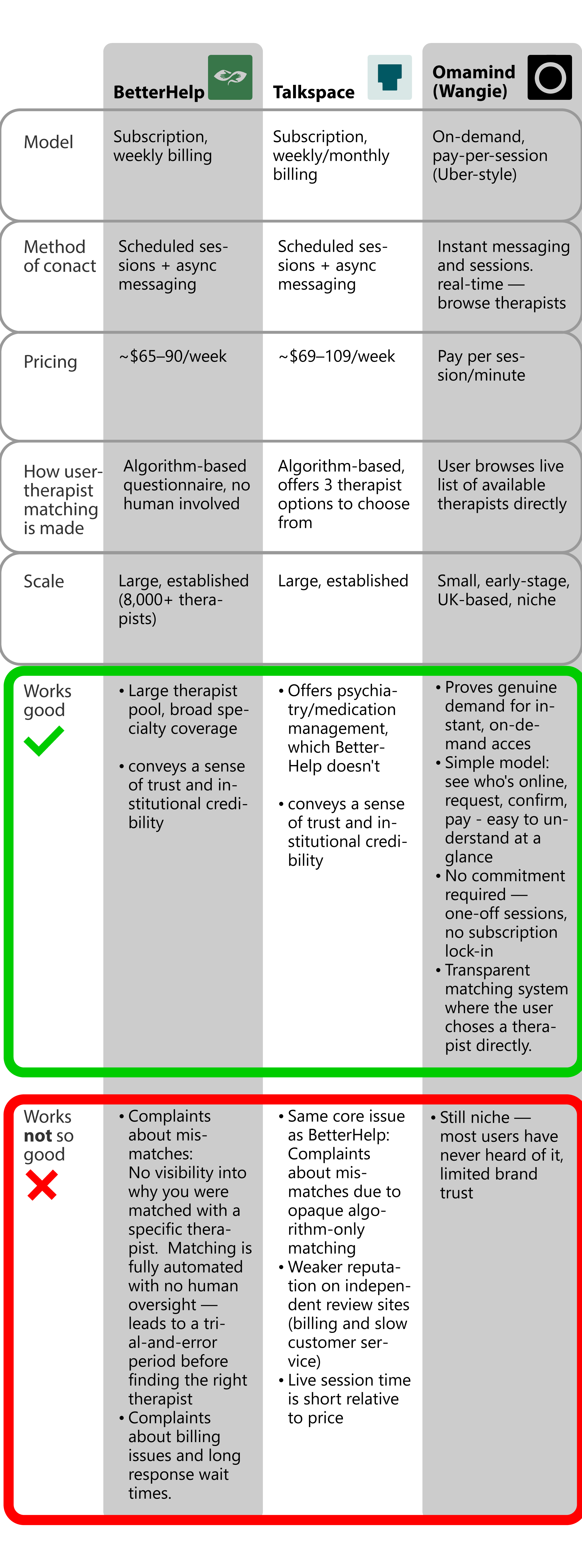
The market is dominated by two large, subscription-based, appointment-driven Apps: BetterHelp app
 Talkspace app
They use opaque matching method between user and therapist (Algorithm-based questionnaire) and have long waiting time for Appointments. For those two attributes they do differ a lot from the model of Herenow app.
A smaller new start up in the UK is currently developing an app that is for now the only app out there with a solid similarity to the Herenow app concept: Omamind app (before was called Wangie)
They supposedly offer instant connection to a therapist who is online, using transparent matching (user chooses directly).
 Click to enlarge
 Users Research
Real users complaints and comments about BetterHelp and Talkspace apps were gathered from app store reviews, independent comparison sites, mental health forums and similar platforms. This is a secondary-research approach, which can also be called review mining. At this stage, no live interviews were made.
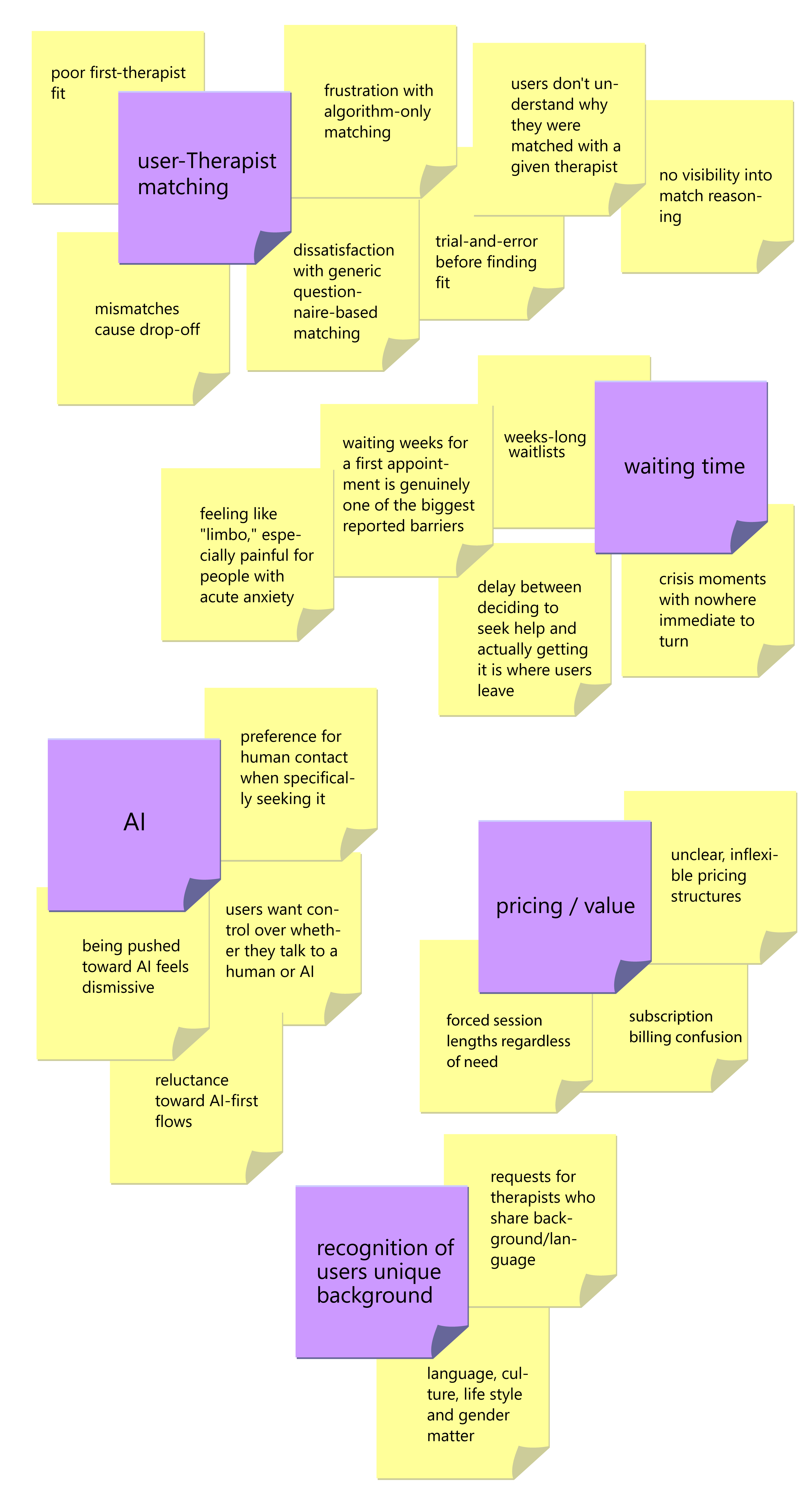
Affinity Mapping:
 Click to enlarge
 Research Findings:
- Frustration with algorithm-only matching leading to a poor first-therapist fit, with no explanation of why that match was made
- Long waitlists described as feeling like “limbo,” especially painful for people with acute anxiety
- Billing and subscription confusion — unclear what’s being charged weekly vs. monthly
- Appreciation when matched quickly (“got a counsellor within 24 hours”) but frustration when the quality of that fast match was poor
- Reluctance to be rushed toward AI-only support when someone specifically wants to talk to a person
- Cost sensitivity — many switch platforms or give up entirely when pricing feels opaque or not worth the session length
- Desire for flexibility — no forced session length, no long subscription lock-in
- A recurring theme in press coverage: waiting weeks for a first appointment is genuinely one of the biggest reported barriers to getting help at all
Beyond the Data: Applying Intuition and Life Experience
I made a deliberate choice to add a core user need: sense of anonymity — even though it didn’t emerge directly from user reviews or app store feedback. This is where I relied on intuition, informed by real-life understanding of human behavior, rather than solely on what’s explicitly reported.
Not every user is the type to write reviews or openly share their opinions and experiences — and this silent group may actually represent more than half of all users. Many people who need psychological support never take the first step to seek it, simply because of embarrassment or shame. The sense of anonymity that an app-based platform can offer directly addresses that barrier — even though it’s a need users rarely articulate out loud.
And that makes sense: the very users who would benefit most from anonymity — the ones holding back out of shame — are not the type to leave public. Their silence isn’t an absence of need; it’s a symptom of it.
This is a case where designing only from visible data would have missed something essential. Recognizing that gap, and designing for the users who don’t speak up, is where lived experience and human intuition become part of the design process itself — not a replacement for research, but a necessary complement to it.
User Persona
The users persona below are a composite built from the patterns above, not a real individuals
#1 Persona
Name: Maya Chen
Age: 29 | Gender: female | Role: Marketing coordinator, based in a mid-sized city
Context: Maya has been dealing with rising anxiety over the past few months, partly tied to work stress and a recent breakup. She’s never used therapy before and feels a bit nervous about starting.
Goals
- Talk to someone as soon as she works up the courage — not weeks later when the moment has passed
- Find a therapist who understands her specific situation (relationship stress, anxiety) without a long trial-and-error process
- Stay in control of whether she talks to a person or eases in with something lower-stakes first
Frustrations
- Tried researching BetterHelp once, got overwhelmed by the intake questionnaire and gave up before finishing
- Worries about being matched with someone who doesn’t “get” her background or communication style
- Dislikes the idea of being funneled into a chatbot when she actually wants a real conversation
- Anxious about cost — doesn’t want to commit to a subscription before knowing if it’ll even help
Quote (illustrative, not verbatim from a real user) “I want to talk to someone today, not in three weeks — but I also want to know I’m not just being handed off to whoever’s free.”
#2 Persona
Name: James Wittenfeld
Age: 47
Gender: Male | Role: Operations manager, recently separated
Context: James is going through a divorce after 18 years of marriage. He’s never been to therapy and feels some stigma around it, but a friend suggested talking to someone who specializes in divorce.
Goals
- Find a therapist who specifically handles divorce/separation, not a generalist
- Get support during acute moments (a bad night, a hard conversation with his ex) rather than waiting for a scheduled slot
- Keep things discreet — doesn’t want coworkers or family to know
Frustrations
- Uncomfortable with the idea of a chatbot — wants to feel heard by an actual person given the weight of the situation
- Skeptical of generic “anxiety/depression” categories that don’t reflect his specific situation
- Doesn’t want to commit to a long subscription before knowing if therapy is “for him”
Quote (illustrative): “I don’t need someone who does ‘general counseling’ — I need someone who’s actually dealt with divorce cases before.”
#3 Persona
Name: Alex Rivera
Age: 22 | Gender: Non-binary | Role: College student
Context: Alex has struggled with depression since their teens and has used free AI wellness apps before, but has never had access to affordable human therapy. Money is tight, and they’re wary of platforms that feel expensive or judgmental.
Goals
- Access affordable, low-commitment support — pay only for what’s used, no subscription
- Find a therapist who is LGBTQ+-competent and won’t require re-explaining their identity from scratch
- Have the AI option available as a genuine low-pressure starting point, without it feeling like a lesser experience
Frustrations
- Past experience with generic matching quizzes that ignored identity-specific needs
- Anxious about cost surprises — has abandoned signups before hitting a paywall
- Doesn’t want to feel “triaged away” from a human therapist just because they started with AI
Quote (illustrative): “I just want to know a therapist actually gets my life without me having to explain everything from zero.”
#4 Persona
Name: Sandra Osei
Age: 54 | Gender: Female | Role: Nurse, mother of two teenagers
Context: Sandra is struggling with how to support her teenage son through a difficult period and wants parenting-focused guidance. English is her second language, and she’d feel more comfortable discussing sensitive family matters with a therapist who understands her cultural background.
Goals
- Filter therapists specifically by parenting specialty, language, and cultural familiarity
- Fit sessions around unpredictable nursing shifts — needs real flexibility, not a fixed weekly slot
- Feel confident the therapist will respect cultural context around family and parenting, not apply a one-size-fits-all approach
Frustrations
- Past experience being matched with a therapist who didn’t share her language, making nuanced topics hard to discuss
- No visibility into a therapist’s cultural background or approach before starting
- Little flexibility in scheduling around irregular work hours
Quote (illustrative): “I don’t want to start over explaining my culture every single session — I want someone who already understands where I’m coming from.”
UX Design
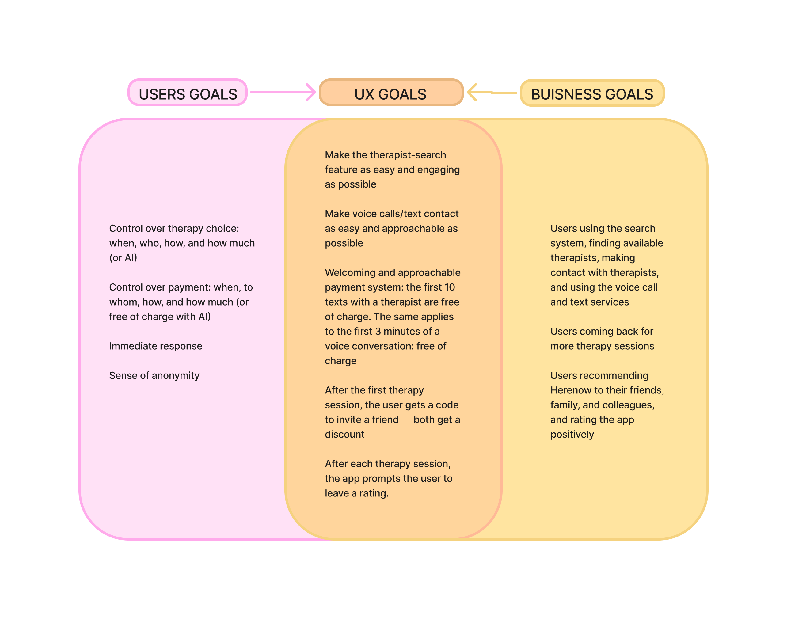
Prioritization– projects Goals:
- Control: Give users a sense of control over who they talk to and when.
- Flexible payment: Let users pay based on actual usage — “you don’t talk, you don’t pay.”
- Immediate access: Give users the feeling of immediate access — no long waits.
- AI as a free option: Position AI support as the only free-of-charge option.
- Sense of anonymity: Let users access Herenow without providing personal details, preserving a sense of anonymity.
 Click to enlarge
 Information Architecture
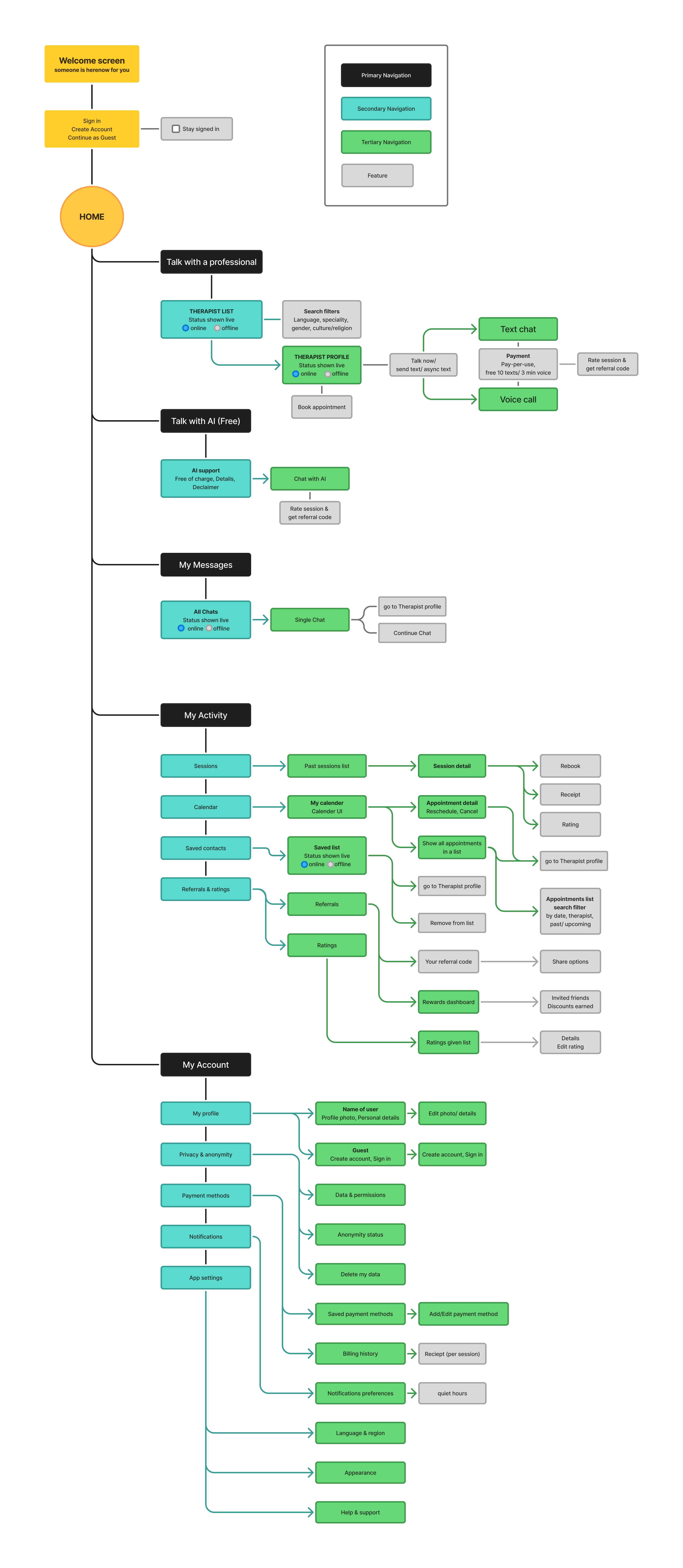
After defining the core user goals — control, immediate access, flexible payment, an AI-based free option, and anonymity — I mapped out Herenow’s information architecture to establish how content and features would be organized before moving into user flows or screen design.
I built this in FigJam, starting with the top-level structure (Home branching into Get Support, AI Support, My Activity, and My Profile) and then drilling into each branch individually to keep the hierarchy legible at every level.
Structural decisions:
- Talk with a professional reflects the core “instant access” model — filtering by live availability, not just standard criteria like specialty or language.
- Talk with AI emphasizes that it’s free of charge.
- My Activity groups everything the user owns and returns to — sessions, a calendar for scheduled appointments, saved-for-later therapists, referrals, and ratings.
- My Profile deliberately lists “Continue as guest” before “Create account” or “Sign in,” reinforcing the anonymity-first philosophy from day one of the experience, not just as a settings option buried later.
- Under Privacy & Anonymity, ‘Delete my data’ feature was important for me to include — for a mental health app especially, giving users a clear, easy way to erase their history, what reinforces the anonymity promise.
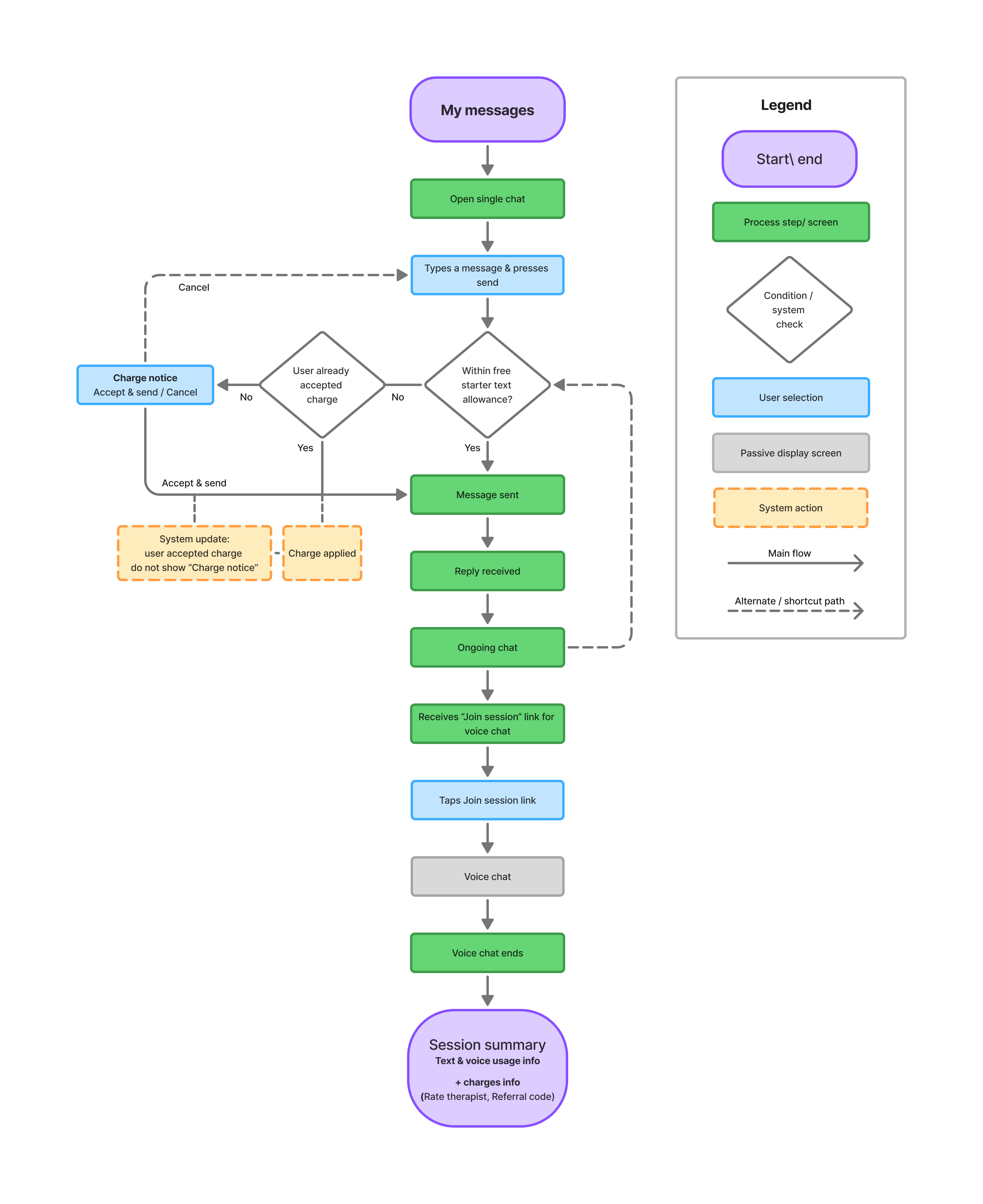
I kept this IA intentionally separate from user flows (which map decision points and edge cases, like what happens if no therapist is online) — the IA shows what exists and how it’s organized; the flows show what the user will actually go through.
 Click to enlarge
 User Flows
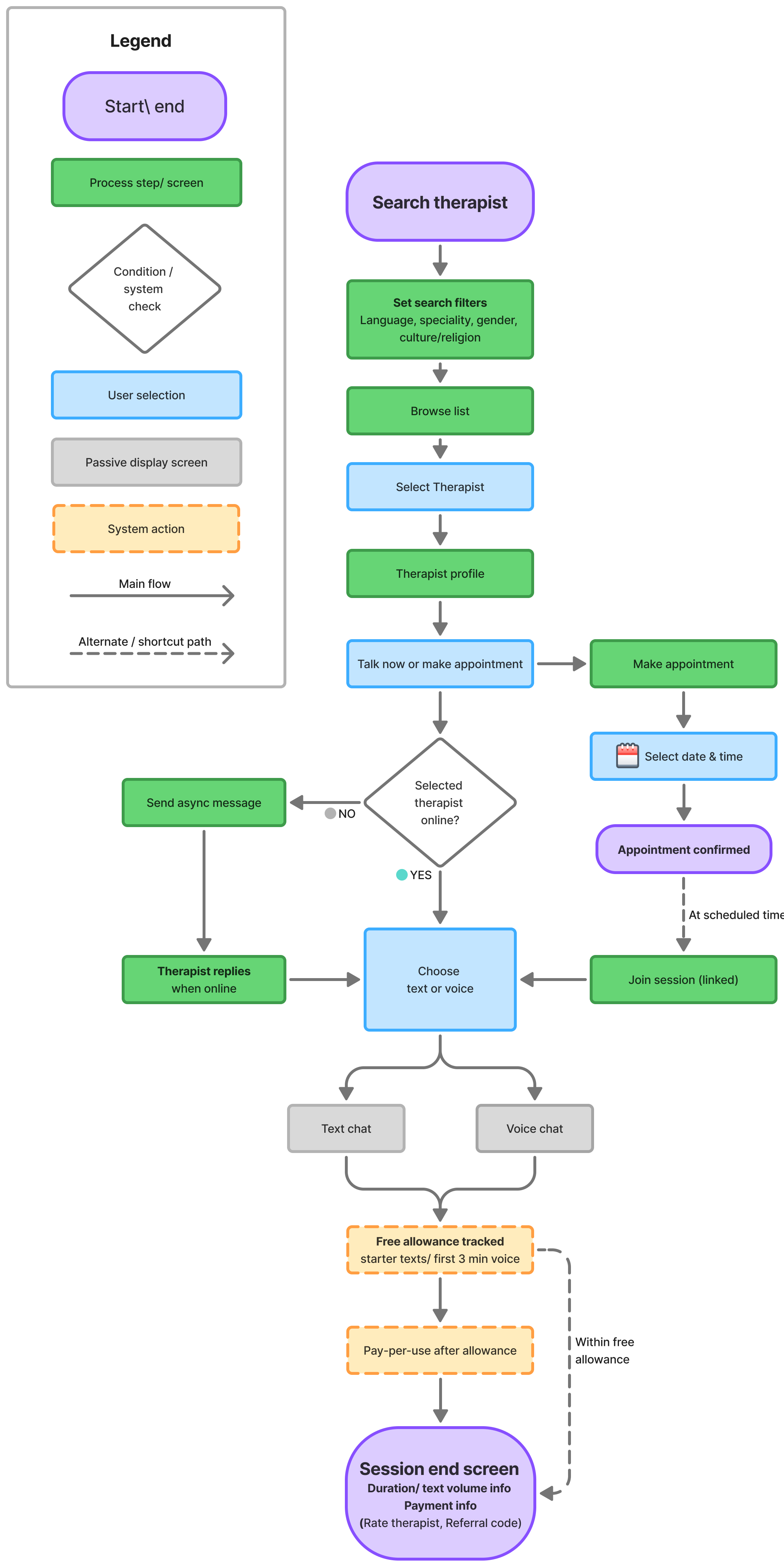
With the IA in place, I mapped user flows to trace the actual paths users take.
Where the IA shows what exists, the flows show what happens.
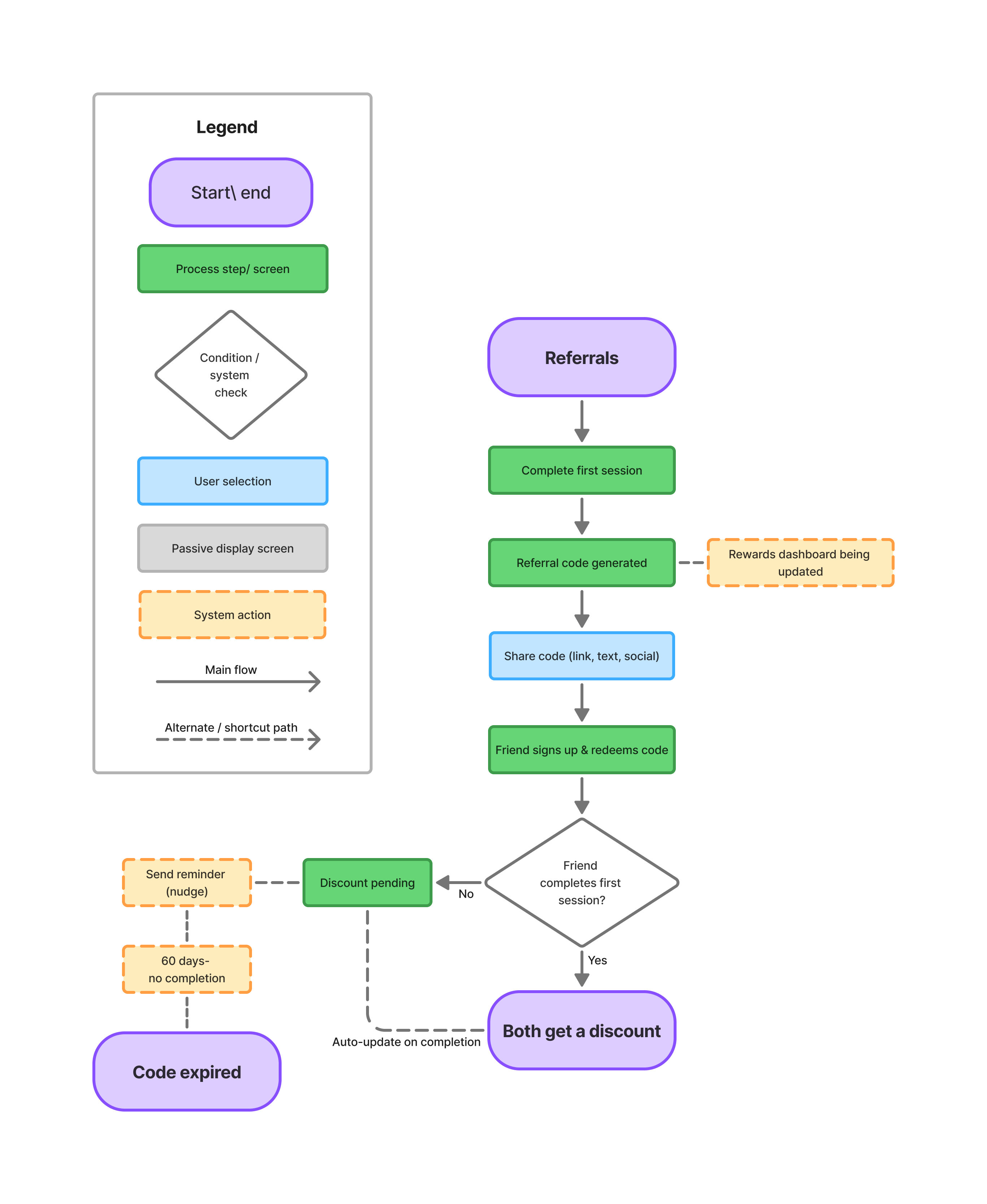
I focused on the areas with meaningful branching:
- Talk with a professional — what happens when a therapist is offline: rather than blocking the user, they can send an async message and get notified when the therapist replies.
- My Calendar — scheduling a new appointment vs. managing an existing one.
- Referrals — the two-sided reward flow, from code generation to both users getting a discount.
 Click to enlarge
  Click to enlarge
  Click to enlarge
 Wireframes
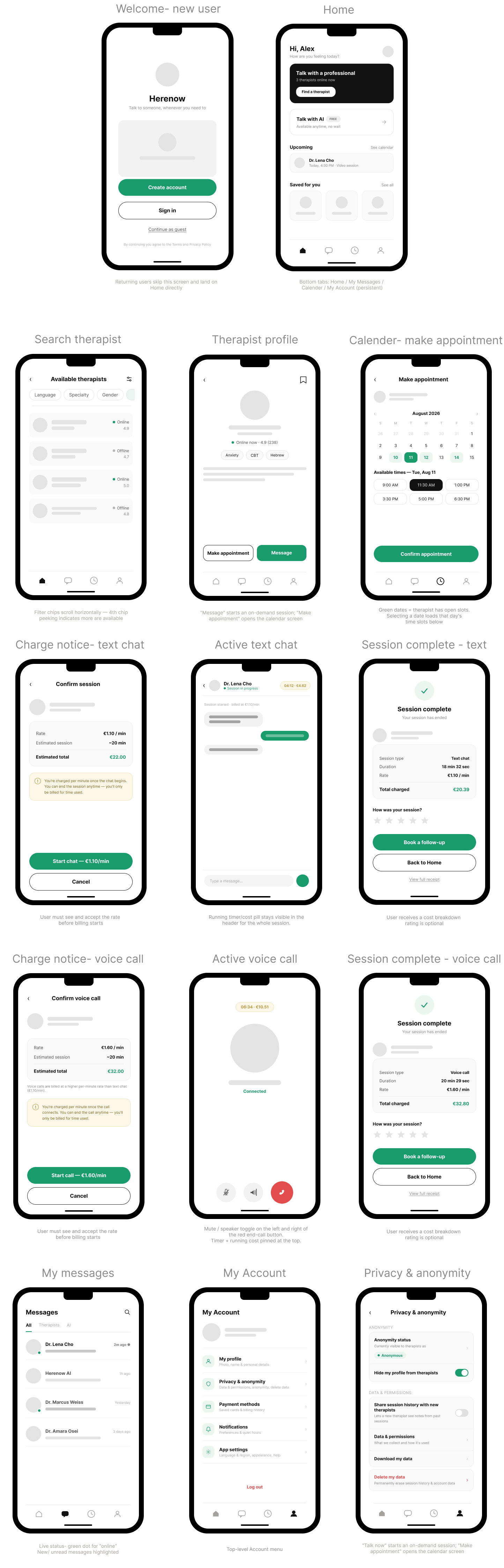
With the information architecture and some basic user flows finalized, I moved into low-fidelity wireframes to map out the core user journey — from first launch through booking a therapist, running a live session (text or voice), and closing out afterward. The goal at this stage was to test structure and flow before investing in visual design, so every screen uses a consistent, deliberately minimal system: gray placeholder blocks for content, a single green accent for primary actions, and a persistent bottom tab bar tied to the app’s top-level IA (Home, My Messages, My Calender, My Account).
A few decisions I focused on at this stage:
- Transparent, upfront billing. Since sessions are billed per minute, I designed a “charge notice” step before every chat or call begins — showing the rate, an estimated total, and requiring explicit confirmation. This builds trust before money changes hands, which felt critical for a platform handling sensitive conversations.
- Consistent session lifecycle. Every session — text or voice — follows the same pattern: charge notice → active session → session summary with a full cost breakdown and optional rating. Keeping this structure identical across both formats reduces cognitive load for users switching between them.
- Privacy as a first-class flow. Given the mental health context, I gave anonymity and data controls their own dedicated screen rather than burying them in general settings, including a clear “delete my data” option.
- Flexible entry points. Users can start a session from multiple places — the Home screen, a therapist’s profile, or the calendar — without breaking the underlying flow, mirroring how people actually behave when they’re deciding between “talk now” and “schedule for later.”
- Bottom navigation visibility
The bottom nav is hidden on 6 screens: charge notice (voice/chat), session complete (voice/chat), and active session (voice/chat). These are focused, single-task moments — the user is either about to be charged or actively in session — so removing the nav keeps their attention on the current action instead of inviting them to navigate away.
First wireframes sketch:
 Click to enlarge
 Iterations:
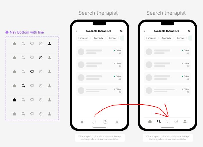
1- Catching a Navigation Gap in the bottom navigation bar
Before: My first wireframe pass gave the bottom navigation four icons — Home, Messages, Calendar, and My account — mapped directly from the app’s information architecture. Each one corresponded to a top-level destination, and on paper the structure looked complete.
The catch: While reviewing the wireframes against Herenow’s core user flows, I realized the only way to search for new therapists was to go through Home → Talk with a professional. It is very inefficient to have to always go through Home screen in order to get to Search therapist screen. Through the Messages and Calendar quick navigation links a user can only find therapists that she or he already have history with. There was no direct, from wherever in the app, one-tap way to get to the Search therapist screen.
The fix: I added a Search icon to the bottom navigation, giving users a persistent, always-visible entry point to find and filter therapists. Most important- make it quick and easy, regardless of where they are in the app. I updated the wireframe to reflect this five-icon navigation bar, and that revised version — not the original — became the reference I carried forward into the high-fidelity screens.
2- Creating better negative space and division of graphic elements in order to guide actions
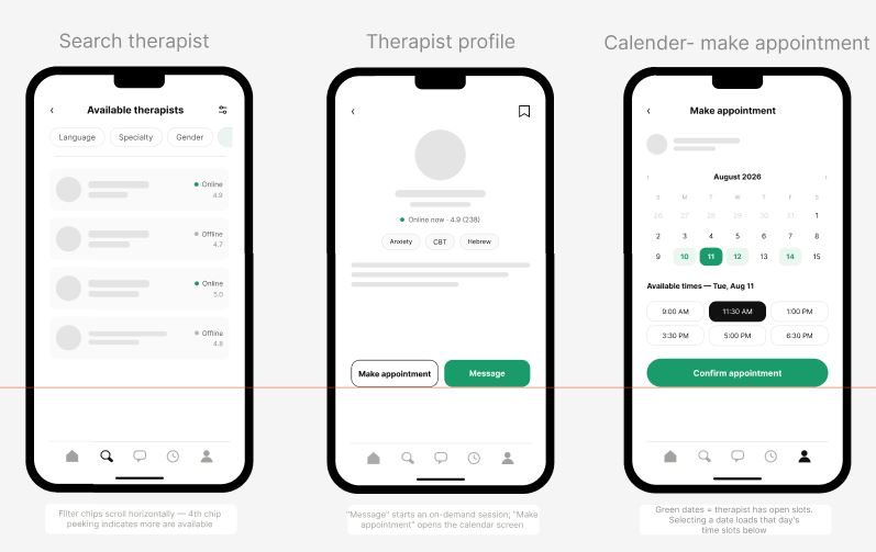
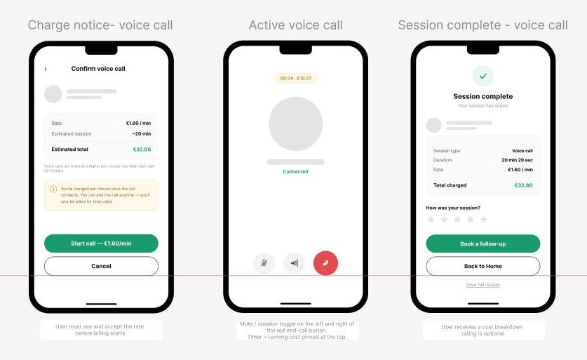
Final wireframes:
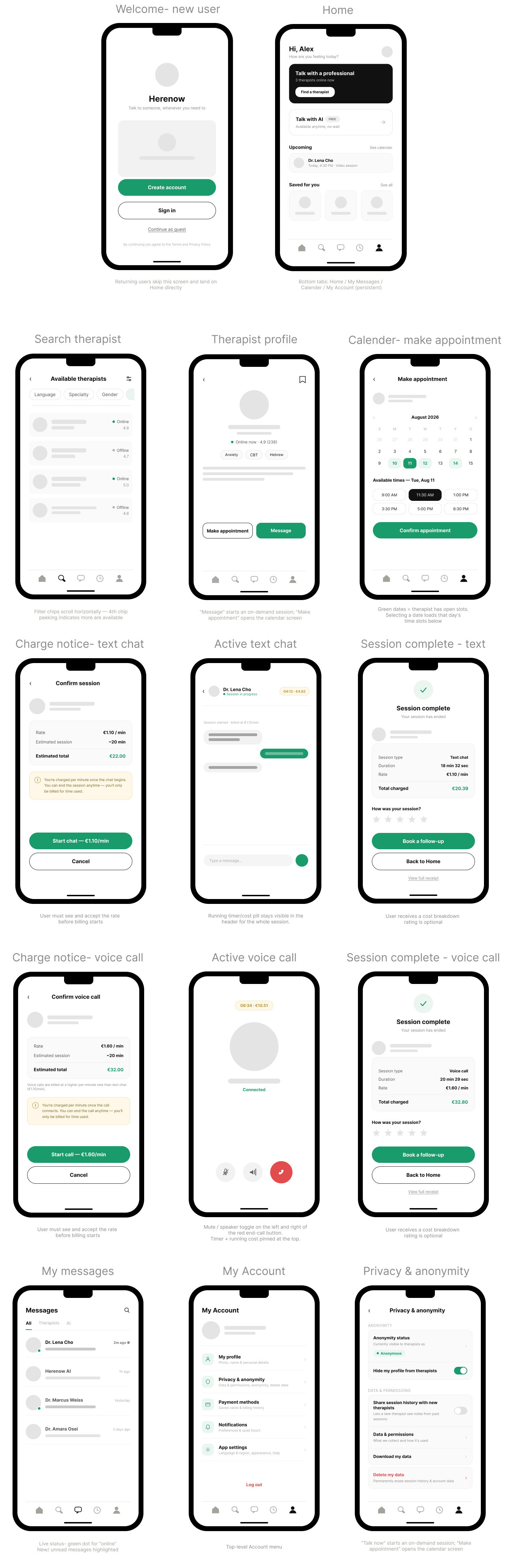
Lesson learned: Reviewing a wireframe screen-by-screen can make everything look present and accounted for. It wasn’t until I traced an actual end-to-end user scenario through the navigation that the gap became visible. It’s a small reminder that structure should be validated against real journeys, not just a checklist screen by screen — and that catching this at the wireframe stage meant it cost me one icon, not a rework of finished high-fidelity screens.
Having a few more iterations after the first sketch is always important. Just like a building needs a strong foundation, the wireframes had to be solid before I could start building the façade on top.
UI Design
Brand identity
Before diving into the 3 optional designs I suggest for this app, I wish to explain my very basic approach to interactive visual design, where the goal is keeping the user focused and engaged. To bring him or her to COME BACK and WANT MORE.
For this I keep it clean and clear- to avoid clutter that can fatigue the user.
I usually use only 3 main colors, where only 1 color is very vibrant and meaningful- and that color guides the storytelling and the actions of the user. I always create original illustrations that fit precisely to the impact and meaning I’m aiming for.
- The emotional aspect of psychology
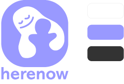
Colors: White, lilac, dark grey
When creating the visual identity for this app, the first emotion that came to my mind is comfort- from the idea of being comforted when experiencing a difficult emotion. And the first color that corresponds with this feeling is a cool lilac- that just immediately comforts and creates a feeling of tranquility. I chose a graphic symbol of a hug- a representation of “someone is here for you”. And I chose the cool tranquil lilac as the main color.
This first design’s core emphasis is on warmth, human connection, the feeling of being hugged, accepted and understood. - The intellectual aspect of psychology
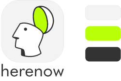
Colors: Neo green, light grey, dark grey
The emphasis here is on self-realization, focus, clarity, “clear head”.
The icon of the head represents the idea of one opening up with his own thoughts and feelings. The goal of the clean greys with neo green is to create focus and clarity. The neo green brings a retro vibe of “digital vs reality” and touches the concept of perception- which can be interpreted as self-reflecting, understanding oneself, thinking, emotions and thought processing. - The interaction aspect of psychology.
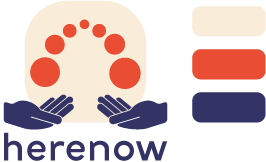
Colors: warm beige, Ember red, deep navy purple/blue
This design focuses on the idea of two-sided communication. The user is exchanging thoughts/words/emotions with another in a reciprocal action. The circles represent an exchange of thoughts.
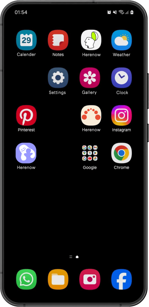
I was testing to see how these icons would naturally look on a mobile phone home screen:
Typography
For Herenow’s typography I chose two fonts: one to be used for the name brand itself — to create a unique visual identity for the brand. The other font I chose is not unique at all; its purpose is to be used across the app itself, and it should be familiar to the eye, reliable and trustworthy.
For the name brand I explored Abadi MT Pro (lilac-Hug design), Quasimoda (neon-green-head design), and Fenwick(ember-circles design). They all have a geometric structure that works beautifully in large headlines. It’s softened by rounded forms which still give the headlines warmth without losing clarity. It’s clean and pleasant without competing for attention.
For Herenow’s typography across the app itself, I chose Inter — an extensively used and tested font, designed specifically for screen interfaces. It reads fast, it’s clear and clean. It’s reliable. It stays crisp and legible at small sizes, and has a wide range of weights. I deliberately kept the type neutral. The personality of the brand lives in its color palette, illustration and design style, while the typography stays out of the way and does its job.
 —After consulting three different colleagues, I decided to move forward with the neon green “head” design.
Excuse me if you notice two versions of the official neon green throughout the process. It took me a while to find the exact right one.
High fidelity key screens
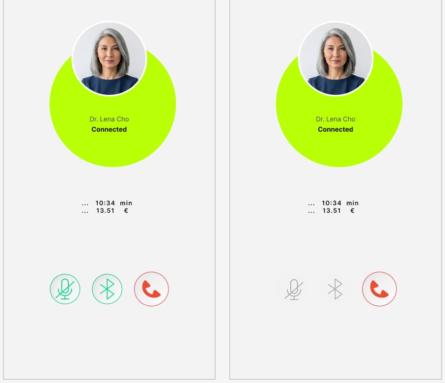
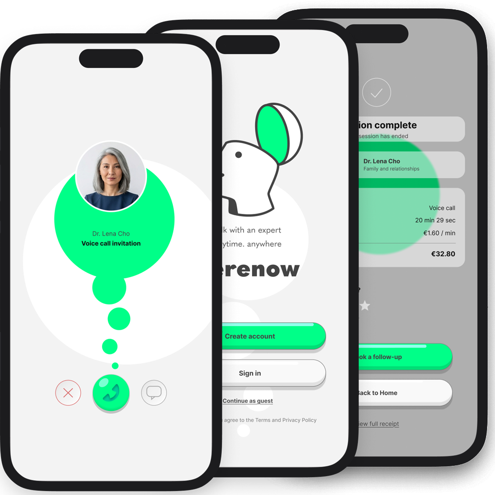
I took my time getting the neo green color right. I wanted users to easily focus on their actions and complete them — the green guides their attention and the flow of action across the screens.
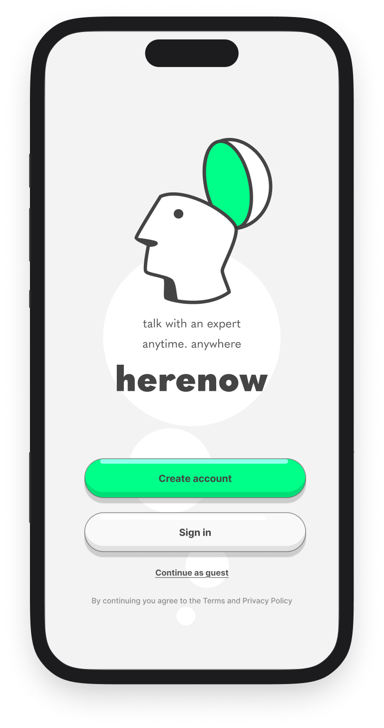
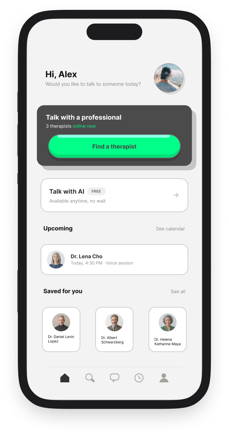
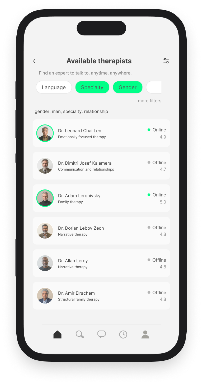
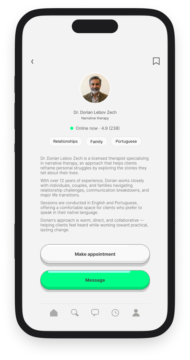
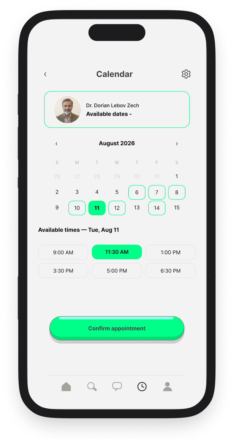
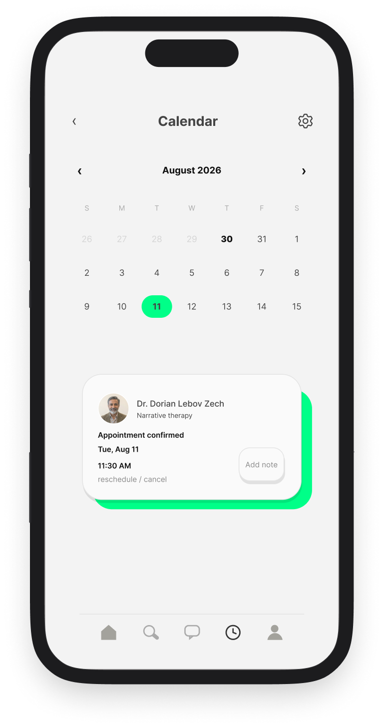
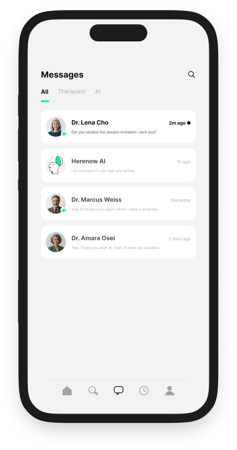
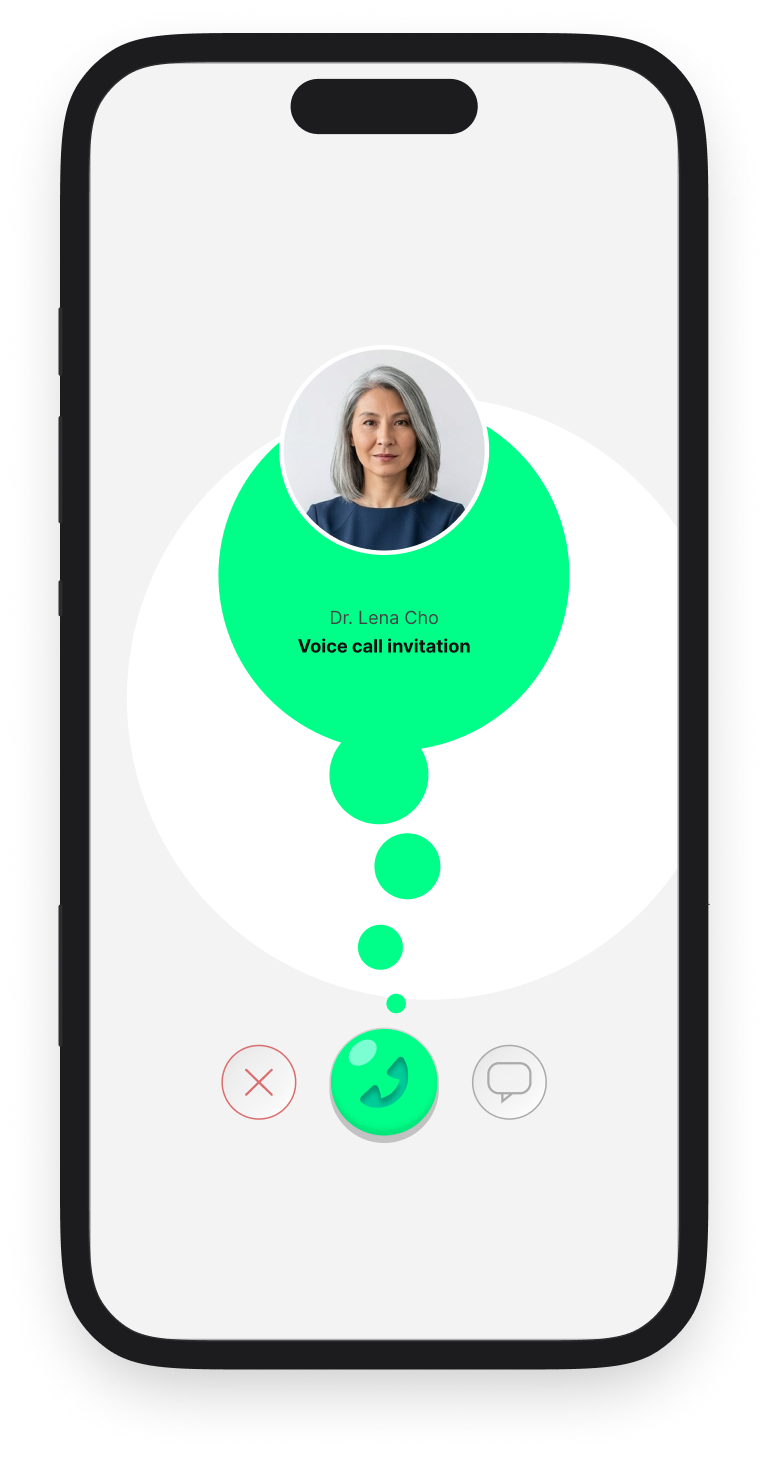
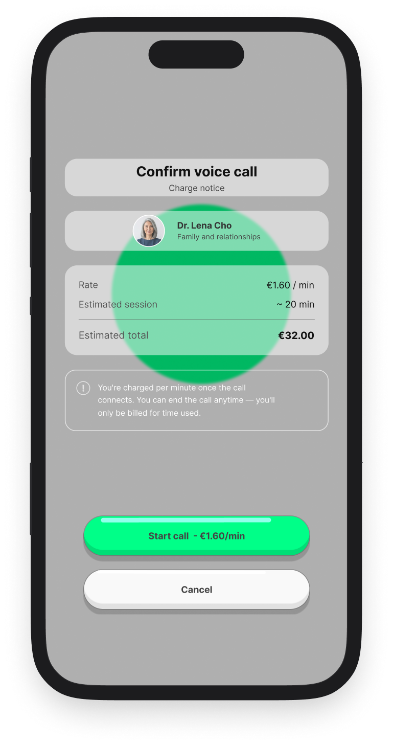
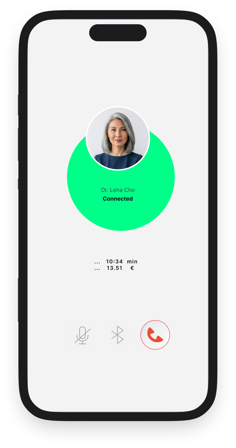
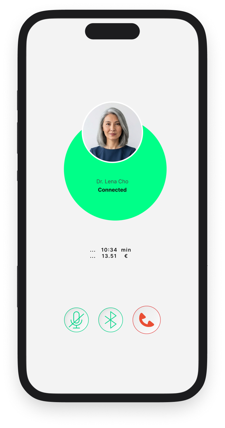
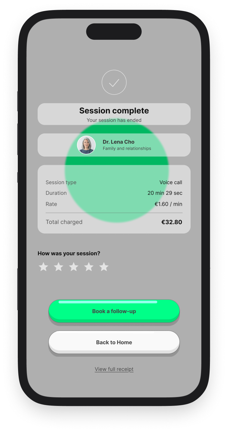
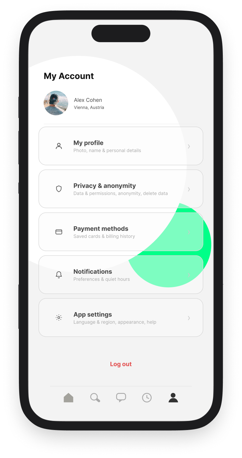
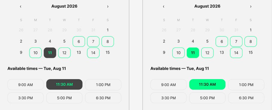
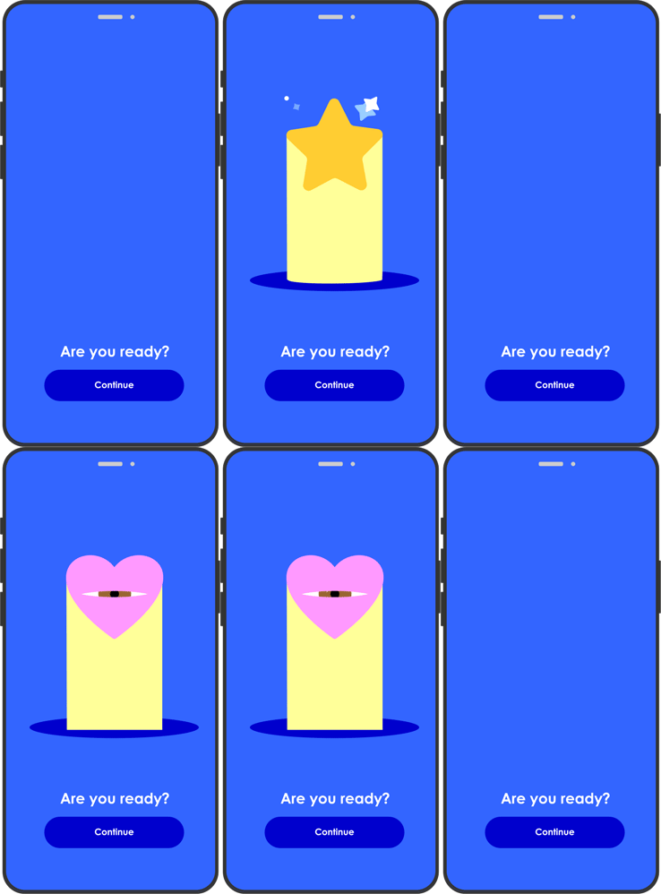
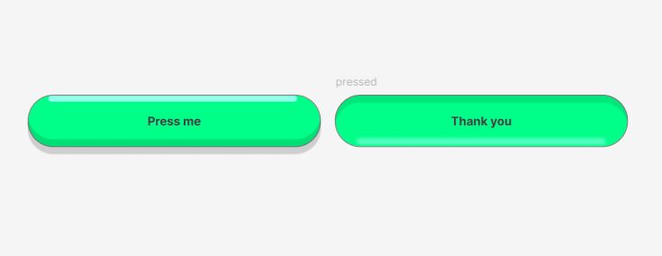
It was also important to me how each button looks when it’s being pressed. I believe an attractive button can tempt adults to press it, just like it does a child — even when that button is really an agreement to be charged a fee.
UX observations and suggestions for improvement
GEORGE web online banking – case study
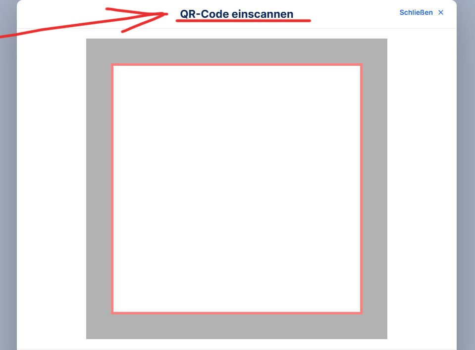
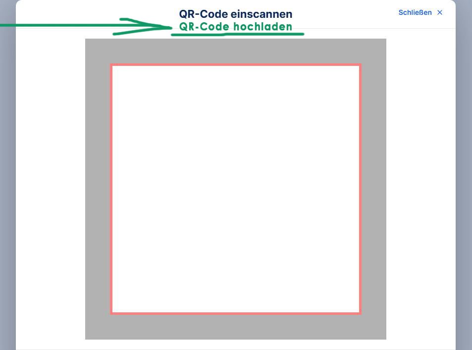
QR-Code problem
It’s extremely irritating when a user wants to make a payment on the same device that received the QR code. We’ve all been there — screenshotting a QR code just to send it to another device. A total waste of time and energy.
Failed orders (payments)- problem
When a bank user has a failed payment due to insufficient funds, notifying the user and having this information accessible and easy to reach is of high priority. Such a feature SHOULD be easy to locate. Unfortunately, this is terribly handled by George online banking, both on the website and the app.
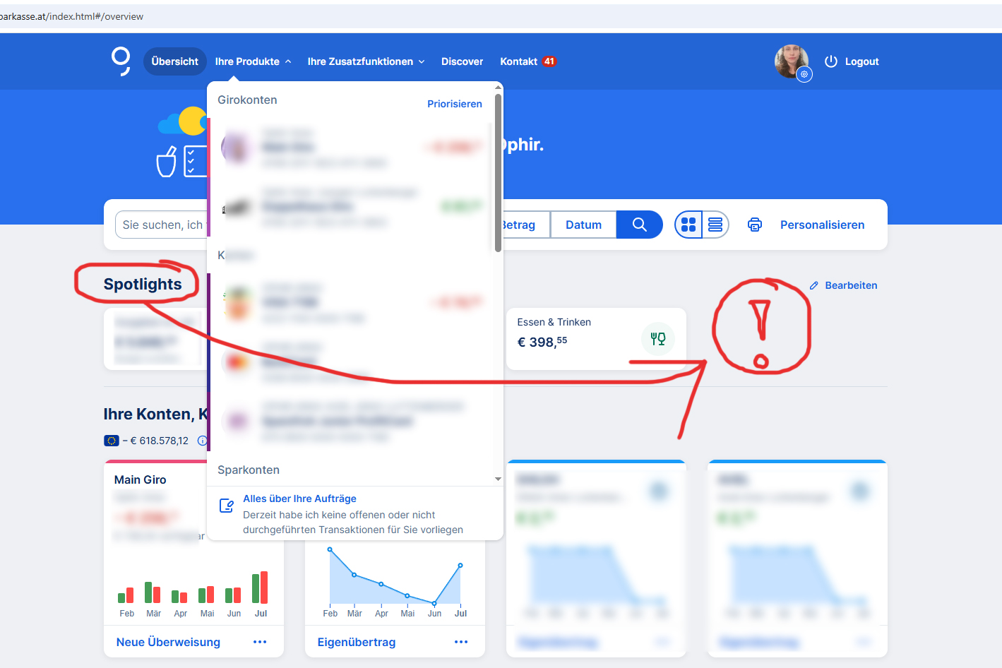
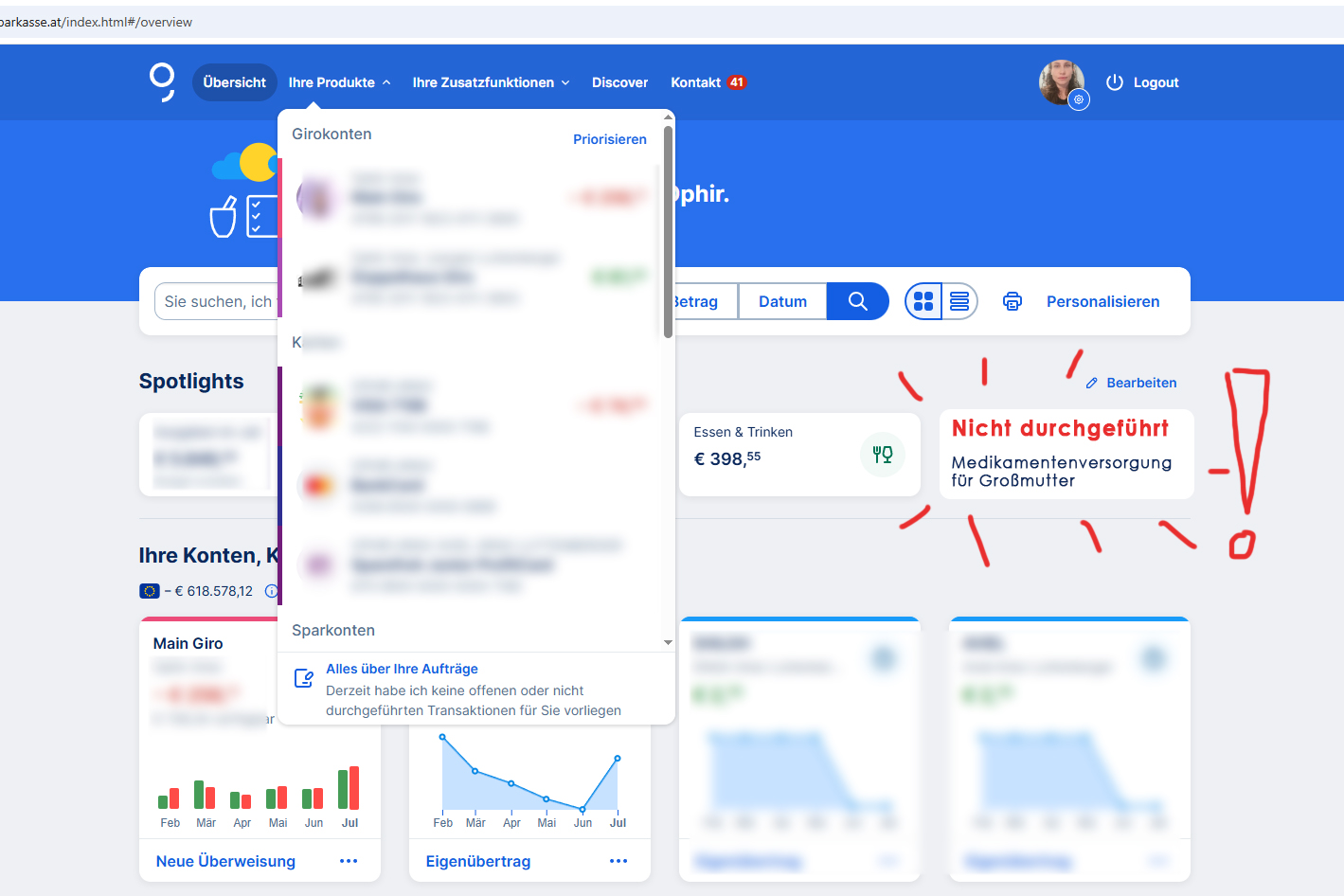
Supposedly the only way George online banking platform gives access to this info is by:
1 – “Ihre Produkte / your products,” which means choosing the account where the failed order happened
2 – “Alles über Ihre Aufträge” / “all about your orders”
3 – And then SCROLL ALL THE WAY DOWN (already a problem)… hoping that at the very end of ALL orders, someone can find the section “Nicht durchgeführte Aufträge” / “Failed orders”
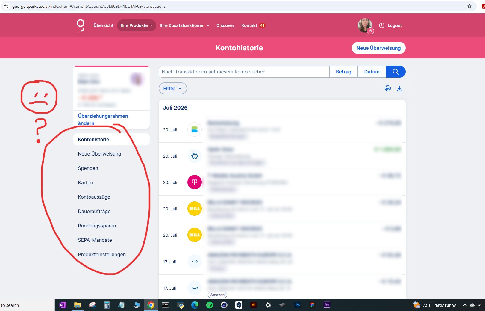
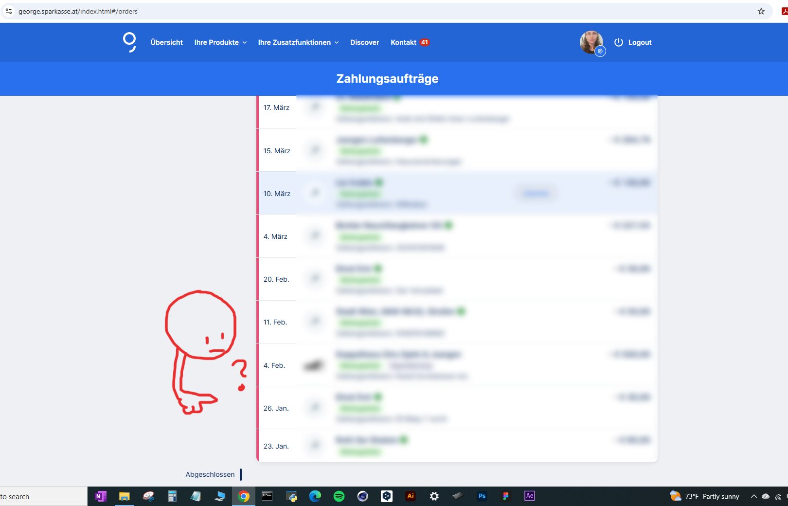
And, no. No sign of “fehlgeschlagenen Aufträge / Failed orders.”
Seriously, Erste Bank — these can be payments that affect children care, safety and health issues.
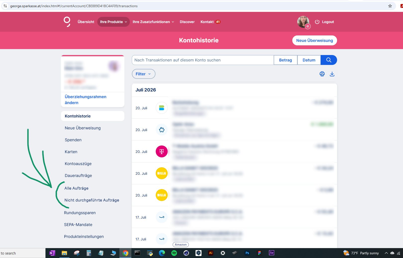
“Alle Aufträge”
“Nicht durchgeführte Aufträge”

